Creating Harmony: Tips for Combining Different Interior Colors in Your Home
Introduce: Interior Colors
As an interior designer and blogger, I have always believed that color plays a crucial role in creating a harmonious and visually appealing space. The right combination of colors can transform a dull and lifeless room into a vibrant and inviting sanctuary. However, combining different colors in a home can be quite challenging. It requires a deep understanding of color theory and the ability to balance bold and neutral shades. In this article, I will delve into the importance of color in interior design and explore the various challenges that arise when trying to create a cohesive color scheme.
Key Takeaways
- Understanding color theory is essential for creating a harmonious color scheme in your home.
- Choose a color scheme for your home that reflects your style and creates a cohesive look.
- Create a color palette for each room by selecting a dominant color and incorporating complementary and accent colors.
- Balancing bold and neutral colors can add depth and interest to a space.
- Incorporating texture and lighting can enhance the impact of your chosen color scheme.
Understanding the Basics of Color Theory
Before diving into the world of color schemes, it is essential to have a solid grasp of the basics of color theory. Colors can be classified into three main categories: primary, secondary, and tertiary. Primary colors are the building blocks of all other colors and cannot be created by mixing other hues. Secondary colors are formed by combining two primary colors, while tertiary colors are created by mixing a primary color with a secondary color.
Another important aspect of color theory is understanding warm and cool colors. Warm colors, such as red, orange, and yellow, evoke feelings of energy and excitement. On the other hand, cool colors like blue, green, and purple create a sense of calmness and tranquility.
Complementary and analogous color schemes are two popular ways to combine different hues in interior design. Complementary colors are opposite each other on the color wheel and create a high-contrast effect when used together. Analogous colors, on the other hand, are adjacent to each other on the color wheel and create a more harmonious and soothing effect.
Choosing a Color Scheme for Your Home
When choosing a color scheme for your home, there are several factors to consider. Firstly, your style should guide your decision-making process. Are you drawn to bold and vibrant colors or do you prefer a more neutral and understated palette? Understanding your personal preferences will help you create a space that truly reflects your personality.
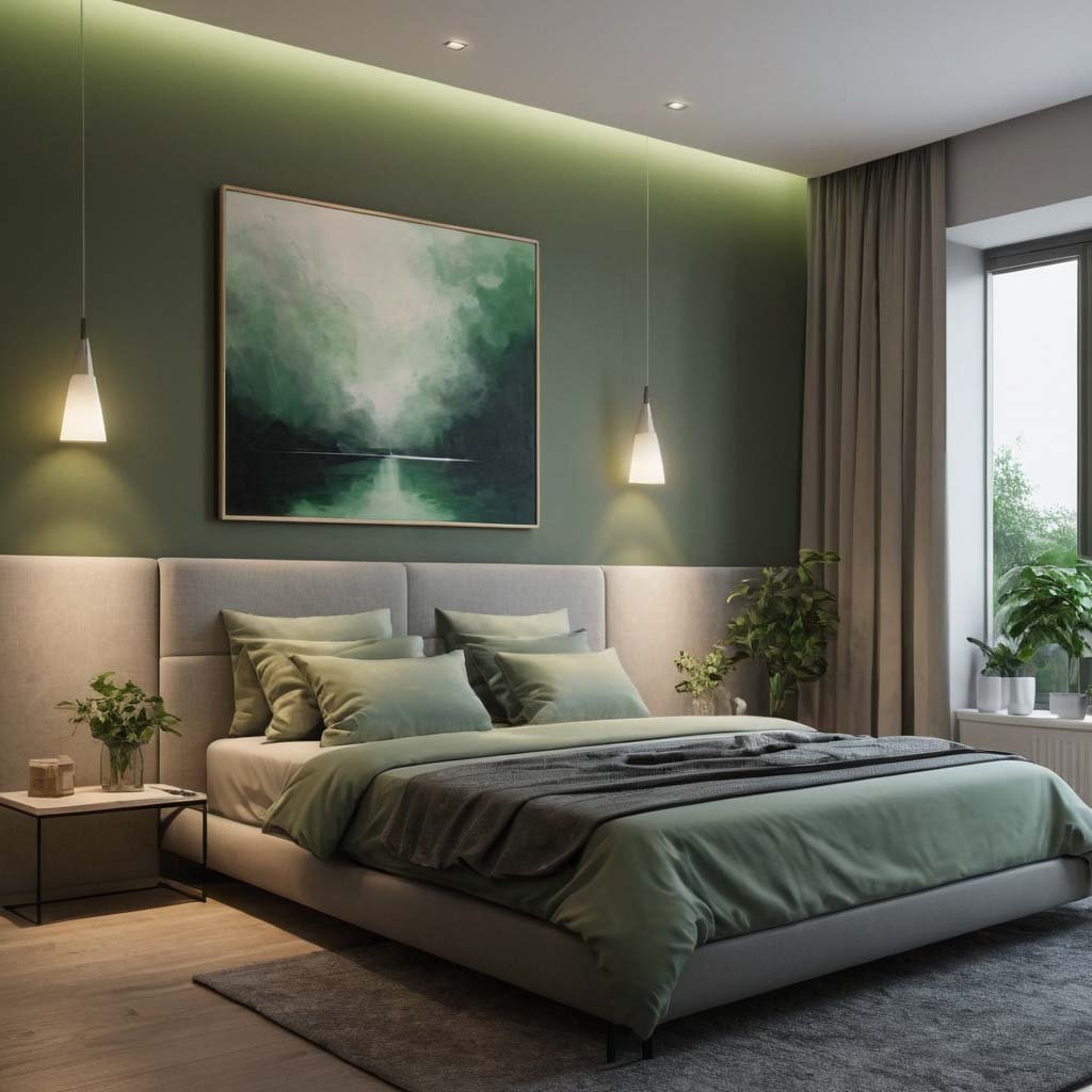
The function of each room is another crucial factor to consider. For example, a bedroom should have a calming and relaxing color scheme, while a home office might benefit from energizing and stimulating hues. Additionally, the amount of natural light in a room should also influence your color choices. Rooms with ample natural light can handle bolder and darker colors, while spaces with limited natural light may benefit from lighter and brighter shades.
There are several popular color schemes that you can consider for your home. A monochromatic color scheme involves using different shades and tints of a single color. This creates a cohesive and sophisticated look. Neutral color schemes, on the other hand, rely on shades of white, beige, and gray to create a timeless and versatile backdrop. Lastly, bold color schemes incorporate vibrant and contrasting hues to create a visually striking space.
Creating a Color Palette for Each Room
Once you have chosen a color scheme for your home, it is time to create a color palette for each room. The first step is to choose a dominant color that will set the tone for the space. This color will be the most prominent and should be used on larger surfaces such as walls or furniture.
To add interest and depth to the room, accent colors can be incorporated. These colors should complement the dominant shade while providing contrast and visual appeal. Accent colors can be used in smaller doses through accessories, artwork, or textiles.
Color can also be used to create a specific mood or atmosphere in a room. For example, cool colors like blues and greens can create a serene and calming ambiance in a bedroom, while warm colors like reds and oranges can add energy and vibrancy to a living room.
Balancing Bold and Neutral Colors
Incorporating bold colors into your interior design can be intimidating, but with the right approach, it can elevate your space to new heights. One tip for incorporating bold colors without overwhelming a room is to use them as accents rather than the dominant shade. This allows you to experiment with vibrant hues without committing to an entire room painted in a bold color.
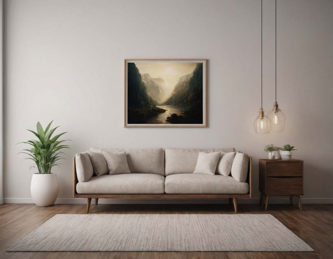
On the other hand, neutral colors can provide a sense of balance and cohesiveness to a space. They act as a backdrop for bolder elements and allow them to shine. By using neutral colors on larger surfaces such as walls or furniture, you create a versatile canvas that can easily be updated with different accent colors over time.
Using Accent Colors to Add Interest
Accent colors are a powerful tool in interior design as they can add interest and personality to a space. When choosing accent colors, it is important to consider the overall color scheme of the room. They should complement the dominant and secondary colors while providing contrast and visual appeal.
There are various ways to incorporate accent colors into your home. Accessories such as throw pillows, rugs, or curtains can be an easy and cost-effective way to introduce pops of color. Artwork and textiles are also great options for incorporating accent colors into your space. By strategically placing these elements throughout the room, you can create a cohesive and visually appealing look.
Mixing and Matching Patterns and Prints
Pattern mixing is a trend that has gained popularity in recent years, but it can be tricky to get right. When combining different patterns and prints, it is important to follow some guidelines to avoid creating a chaotic and overwhelming space.
One guideline is to choose patterns that have a common color or theme. This creates a sense of cohesion and prevents the patterns from clashing with each other. Additionally, it is important to vary the scale of the patterns. Mixing large-scale patterns with smaller ones adds visual interest and prevents the space from feeling too busy.
To create a cohesive look with pattern mixing, it is also crucial to balance the patterns throughout the room. For example, if you have a bold patterned wallpaper, you can balance it with more subtle and understated patterns in the furniture or accessories.
Incorporating Texture for Depth and Dimension
Texture is an often overlooked element in interior design, but it can greatly enhance a color scheme. By incorporating different textures into a space, you add depth and dimension, making the colors come alive.
There are various ways to add texture to a room. One option is to choose furniture and accessories with different finishes and materials. For example, pairing a smooth leather sofa with a chunky knit throw creates an interesting contrast in textures. Additionally, incorporating textured wall coverings or rugs can also add visual interest to a space.
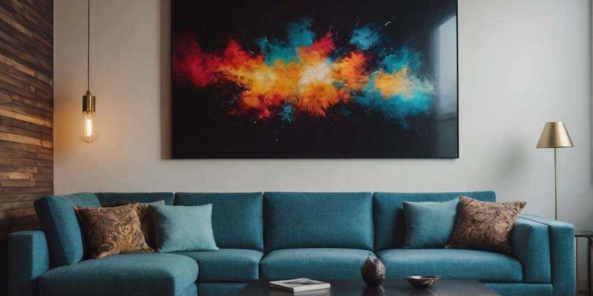
Creating a Focal Point with Color
Color can be used strategically to draw attention to a specific area or feature in a room. By using a bold and contrasting color, you can create a focal point that becomes the center of attention.
For example, if you have a beautiful fireplace in your living room, painting the wall behind it in a vibrant color will make it stand out and become the focal point of the room. Similarly, if you have a stunning piece of artwork, you can use colors from the artwork throughout the space to create a cohesive look and draw attention to the artwork.
Using Lighting to Enhance Color
Lighting plays a crucial role in how colors appear in a space. Natural light brings out the truest colors, while artificial lighting can alter the way colors are perceived.
When choosing lighting for your space, it is important to consider the color temperature of the bulbs. Warm white bulbs create a cozy and inviting atmosphere, while cool white bulbs provide a more energizing and vibrant ambiance. Additionally, the placement of lighting fixtures can also affect how colors are perceived. By strategically placing lights near focal points or artwork, you can enhance their colors and make them stand out.
Tips for Combining Colors in Open Floor Plans
Combining colors in an open floor plan can be challenging as you need to create a cohesive color scheme that flows seamlessly from one area to another. One tip for achieving this is to choose a dominant color that will be used throughout the entire space. This color should be present in each area, creating a sense of unity.
To define different areas within the open floor plan, you can use color to create visual boundaries. For example, you can paint an accent wall or use a different color rug or furniture to differentiate the living area from the dining area. By using color strategically, you can create distinct zones while maintaining a cohesive overall look.
Experimenting with Color to Find Your Perfect Palette
Finding the perfect color palette for your home is a process that requires experimentation and trial and error. It is important to test different color combinations and see how they work in your space before committing to a specific scheme.
One way to experiment with color is by using paint samples or swatches. Paint small sections of the wall with different colors and observe how they look in different lighting conditions throughout the day. Additionally, you can create mood boards or gather inspiration from magazines and online sources to get a better sense of how different colors work together.
In conclusion
Color is a powerful tool in interior design that can transform a space and evoke specific emotions. Understanding the basics of color theory and choosing the right color scheme for your home are essential steps in creating a harmonious and visually appealing space. By experimenting with different colors, textures, and patterns, you can create a home that reflects your style and brings joy to your everyday life. So have fun, be creative, and let color be your guide in home design.
You can learn about other interior design solutions from my blog join, it will be interesting.